[ 2002-December-07 15:30 ]
I started writing these ideas down in August, 2000, thanks to Rob Pike's paper, Systems Research is Irrelevant. However, I soon got distracted and forgot about it. I was reminded that I had started this paper while working at IBM Research working on the Reinventing Email project. It presents a new idea in user interfaces which I believe could be a useful tool for navigating our increasingly complex digital world. This is by no means a formal paper. I have not done a thorough search for relevant research, I have simply cited some examples that I have encountered. It is not backed up by proof, but instead by my opinions. Nor have I completely explained the concept, mostly because I was busy working on other things.
Drowning in a Sea of Information
The information revolution has been touted as the solution to many of our world's problems. Global communication networks and computer technology are changing the world in unprecedented ways, from the omnipresent cellular telephone to the Internet. Many claim that today we are living in the information age. While that may are may not be true, no one can disagree that we are awash in a sea of information. As a simple example, consider email. Email has emerged as the true killer app on the Internet, with more than 891 million email accounts by the end of 2000 [1]. Today, the amount of email that people in the modern workplace must deal with is staggering. Workers in the United States spend an average of 49 minutes a day managing their email [2]. This is an increasing trend everywhere, from the proliferation of information accessible online, to the exploding numbers of email messages, to Internet enabled cell phones. Technologies such as digital video and digital photography mean that people are capturing more about the world around them. Larger storage in the form of cheap hard drives and CD burners mean that people are not deleting the information they are no longer use it, but keep it, just in case. We are beginning to drown in a sea of information.
This is the new challenge to the high tech industry. Information management is already a problem, and will become a bigger one as more and more media goes digital. We are in desperate need of tools to help us manage and navigate the information around us. This paper presents an idea for a new style of user interface that attempts to bring relevant information closer to the user, in a way that it becomes easy and natural to locate what is needed, and to discover useful information that was previously unknown.
Current State of User Interfaces
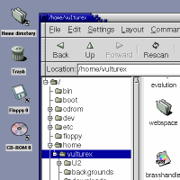
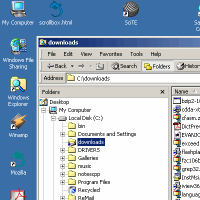
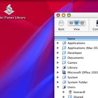
As Rob Pike argues in his paper, Systems Research is Irrelevant, computer user interfaces have not changed significantly since the 1970s [3]. Modern systems, as presented in Figure 1, are built on the Desktop analogy, with applications and files represented by icons on a virtual workspace. However, that paradigm begins to breakdown on modern systems, where files can be hidden in deeply nested folders, inside email folders and databases, on network servers and on the Internet. Users frequently do not understand where their files are stored, relying on applications to remember what directory they saved their files in last. Users also do not use the tools provided for organizing their files, choosing to leave all their files in a single directory instead of creating new ones, and never deleting old files in case they might be used again. These factors only contribute to the sense of confusion that most users have when interacting with modern digital systems. At the same time, this view of digital systems has become very familiar, which means that many have learned the skills required to successfully navigate them.
Figure 1: The Linux, Windows and Macintosh desktops
Examining the Web of the Internet
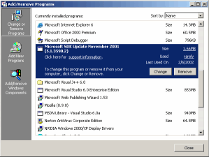
One recent user interface in the digital world is the world wide web. Starting with the web browser Mosaic, users started to explore parts of the world by clicking on links which take them from one page to another. It is the ability to transport the user to totally different sites through a link that is the web's strength. This is also a nightmare for usability, as users must learn different navigation systems as they move from one site to another. However, it is the simplicity of being able to click on a link to get to new information that has made the web catch fire and begin to change everything in the computer industry. From network protocols to web services to user interfaces, the Internet and more specifically, the web, has made a huge impact. As a sign of its popularity, user interfaces for computer programs are beginning to look more like web pages, as can been seen in Figure 2.
Figure 2: The Windows 2000 Add/Remove Programs window looks similar to a web page
The decentralized, unorganized nature of the web is one of its greatest strengths and greatest weaknesses. It is a strength because it is a great equalizer. It allows anyone, anywhere, with a little knowledge of HTML to create a web site that is accessible by anyone in the world. However, this decentralized structure is one of its greatest downfalls as it can be impossible to locate the information that you need. As a result, one tool has developed as an essential for effective navigation of the web: the search engine. Today, search engines like Google index an astounding amount of data, and return reasonably good results when used to locate information. In fact, Google's accuracy even prompted Dan Gillmor to suggest that it renders the DNS system irrelevant since "if you and I can quickly locate the Web address we're seeking, who cares what it's called?" [4].
The missing link in this new connected digital world is the desktop. The search engines, databases and indexes of information on the Internet can not help users find what they need on their own computer. These simple tasks, such as finding a particular email message or document can be performed quite accurately by modern search technology. So why isn't there a Google for the desktop? Google's key idea is that it rates pages by figuring out how many other pages reference it. If many other sites link to a particular page, it is considered to be a better quality information source. However, these references are unavailable on PCs. What is needed is a way to automatically discover related content so that the data can be indexed and organized accordingly.
One possible way to discover the relationships between information would be to watch a user's behaviour. Useful information could be deduced from this seemingly random information [5]. For example, if the user is composing a document and continuously switches to their email program to reference information in a discussion thread, a software tool could discover that the document is related to that email thread. This information could be used to improve search results, or more interestingly, create an easier way of navigating our digital space.
The main concept is to keep the information that is needed for the current task close at hand. A first generation version of this Datalinks user interface could be a panel which slides under the edge of the screen, and pops out when your mouse passes over it. This panel could contain "links" that would open related documents, web sites, email messages, or bring up information on related contacts. The user could access files on their own computer by creating links in certain places, on the desktop, or in their email inbox, or wherever they want. This way, what you need is at your fingertips. Creo Six Degrees attempts to realize this vision by analysing your email. This is a good proof of concept, but to really be this useful this capability needs to become part of the operating system and be part of every application.
Bringing data storage everywhere
To be able to realize this vision, data stored on the system must be accessible from every application, rather than being constrained inside each application. Today, to read email you must open your email client. However, if your word processor wants to find the email thread that is discussing the document you are currently editing, it must be able to access that inbox. Today this is not possible. However, in the future it may be. An article in The Register, a computer rumour web site, discloses that Microsoft plans to include a relational file system in its next version of Windows. As the article describe, this "would allow distributed corporate queries such as 'Find emails from Bob to Carole about ProjectX in FacilityY'" [6]. Hans Reiser, the author of ReiserFS, a file system for Linux, has a similar vision when he states that "The fragmentation of name spaces harms an [operating system] design" in his white paper on unifying file system name spaces [7]. That paper goes on to describe a name space structure that would support many of the requirements of the Datalinks user interface. It appears that some time soon, data will no longer be organized in the traditional file system hierarchy. This will achieve many of the goals of the Datalinks user interface, however a user interface to navigate the new structure will still be required. This new name space model will simply provide the tools for accessing data that this concept requires.
Assuming that we can solve the technical problem of generating good search results for the data on our computers, we are then faced with the challenge of obtaining useful information. Thanks to improvements in storage technology, it will soon be possible to store every document, sound recording and video clip that might ever useful or of interest to us. Microsoft Research's MyLifeBits project is working on exploring the challenges of creating a digital archive of our lives. One of their goals is to "allow people to Google their own lives" [8].
Conclusion
The core idea behind the Datalinks user interface is to use the decentralized organization of the web to create a powerful and intuitive way of navigating a personal computer. It is "decentralized" in the sense that Datalinks brings information together, no matter where the information resides (locally, on the corporate network, or on the Internet) or what application was used to create it. The trick is bringing order to this huge collection of data. The way to do that is by linking together information by the way that it is used. In this way, it would be simple to find the email address of the person who sent the document that the user is editing, or find the other files that they were working on last time they opened this document. Computers, even personal computers for home use, store amazing amounts of data. The challenge is to get the computer to do the searching, and bring what you need to you. This is the future of personal computing.
References
- [1]
- United Messaging (2002). 2000 Year End Mailbox Report.
- [2]
- "The Spam Within: Gartner Says One-Third of Business Email is 'Occupational Spam'," Gartner, Inc. press release, April 19, 2001.
- [3]
- Pike, Rob. "Systems Research is Irrelevant," August 4, 2000.
- [4]
- Gillmor, Dan. "'Google effect' reduces need for many domains". http://www.bayarea.com/mld/siliconvalley/business/columnists/dan_gillmor/2531424.htm.
- [5]
- Matthews, Robert. "Small world theory of why random links matter". http://www.globalideasbank.org/inspir/INS-150.HTML.
- [6]
- "XP successor Longhorn goes SQL, P2P, Microsoft Leaks", The Register, http://theregister.co.uk/content/4/23852.html.
- [7]
- Reiser, Hans. "Name Spaces As Tools for Integrating the Operating System Rather Than As Ends in Themselves", Namesys, http://www.namesys.com/whitepaper.html.
- [8]
- Scheeres, Julia. "Saving Your Bits for Posterity", Wired News, http://www.wired.com/2002/12/saving-your-bits-for-posterity/.


